
Shopify Exit Intent Popup Video Ad: Scripts, Timing, and Conversion Tests


Summarize with
Summary
Build a Shopify exit intent popup video ad that answers objections, clarifies the offer, and supports checkout recovery with practical scripts and testing ideas.
By adsturbo.ai | Published 2026-11-11 | Updated 2026-11-11
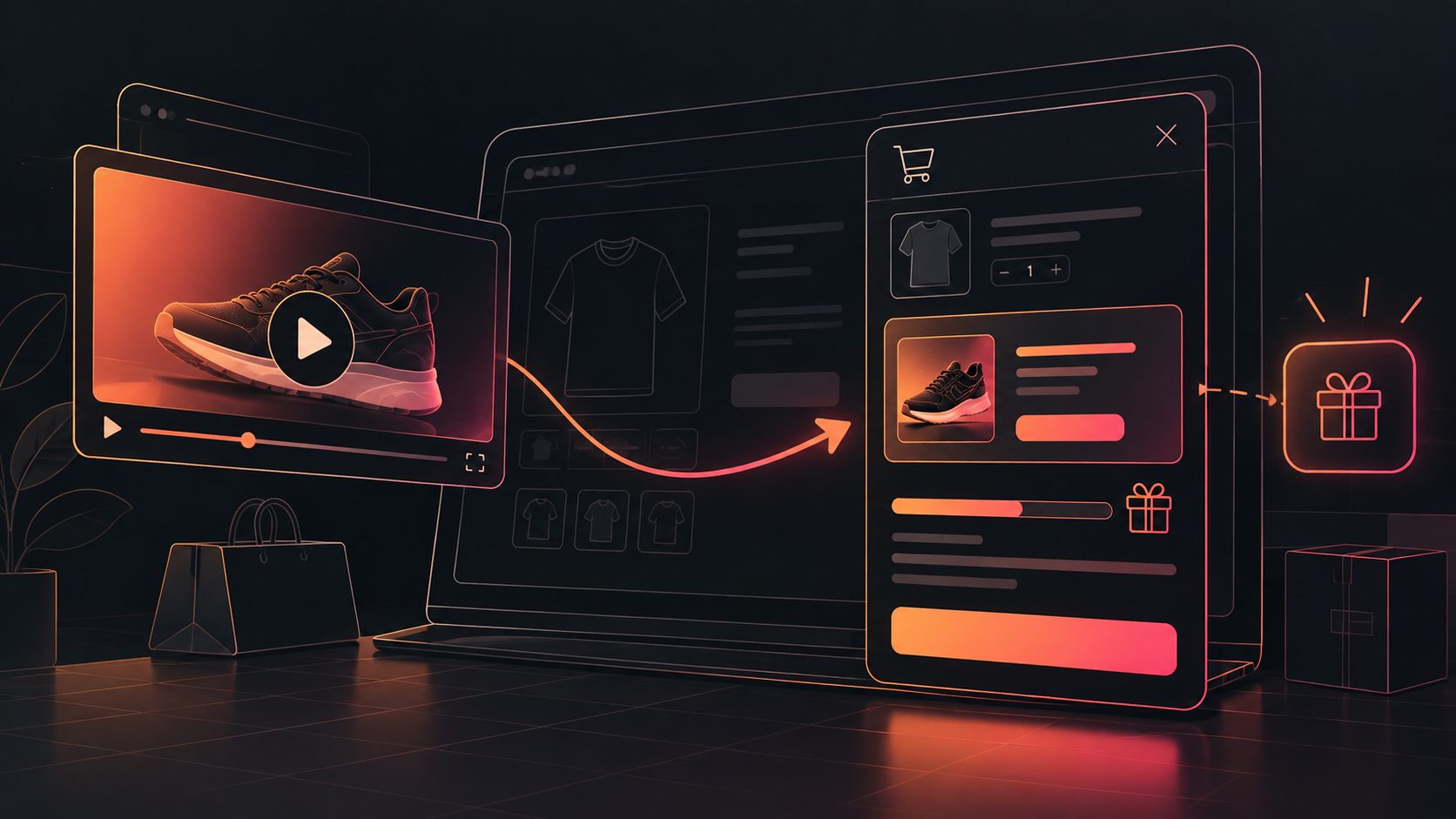
A Shopify exit intent popup video ad is a short, silent-first video shown when a shopper appears ready to leave a store. Its job is not to repeat the product page. It should resolve one final objection, present one clear reason to continue, and lead the shopper to a focused action.
Shopify describes exit-intent popups as messages triggered when visitor behavior suggests they may close the browser or navigate away. Common guidance includes using a strong CTA, relevant imagery, audience targeting, and A/B testing. (shopify.com)
What is an exit intent popup video ad on Shopify?
An exit intent popup video ad is a compact conversion message that combines a popup trigger with short-form product video. It may appear on a product page, cart page, or landing page when a visitor moves toward leaving.
The strongest version follows this structure:
- Recognize the hesitation: “Still deciding?”
- Show useful proof: demonstrate the product, unpack the benefit, or answer a common concern.
- Clarify the offer: state the discount, shipping benefit, bundle, or return reassurance.
- Give one next step: “Return to cart,” “Apply my offer,” or “See how it works.”
This format differs from a standard promotional popup. A static popup asks for attention; a video popup can use motion to demonstrate product use, explain a feature, or make an offer feel more concrete.
When should a Shopify store use one?
Use an exit popup when the visitor has already shown meaningful interest. Strong targeting signals include product-page engagement, cart activity, multiple page views, or a return visit. Shopify Partner guidance similarly recommends focusing on engaged visitors and avoiding irrelevant or poorly timed interruptions. (shopify.com)
A practical trigger matrix looks like this:
| Visitor context | Best message | Primary CTA |
|---|---|---|
| Product page, no cart item | Answer a product objection | “See the product in use” |
| Product page, high scroll depth | Reinforce the main benefit | “Keep exploring” |
| Cart page with items | Recover purchase intent | “Return to cart” |
| Discount campaign landing page | Make the offer unmistakable | “Claim the offer” |
| Returning customer | Avoid unnecessary discounts | “Continue shopping” |
Do not use the same video for every visitor. A first-time product-page visitor may need proof. A shopper with a cart may need shipping clarity or a reminder of what is already selected.
How long should the popup video be?
For most exit-intent placements, start with 6–12 seconds. The video should communicate its central idea without requiring sound, a long watch, or multiple clicks.
A useful timing model is:
- 0–2 seconds: product or visual hook
- 2–6 seconds: proof, demonstration, or objection handling
- 6–9 seconds: offer or reassurance
- Final 2–3 seconds: CTA and readable on-screen text
This is an editorial testing framework rather than a universal rule. The correct length depends on the product and the objection. A visual demonstration may need 10 seconds; a simple discount reminder may need only 5 seconds.
Keep the first frame understandable. Many shoppers will see the popup while multitasking or with autoplay muted. Use large captions, high contrast, and a visible product rather than relying on voiceover.
What should the script say?
A high-performing script should match the reason someone may be leaving. Instead of writing a generic “Wait—don’t go,” use an objection-first message.
Script 1: Product proof
On-screen text:
“Not sure it will work for you?”
Visual sequence:
- Show the product in its normal use.
- Display one specific benefit.
- Show a close-up or before-and-after moment.
- End with “See the full details.”
CTA: “Review the product”
This works best when shoppers need more confidence in quality, fit, use, or performance.
Script 2: Cart recovery
On-screen text:
“Your picks are still in your cart.”
Visual sequence:
- Show the selected product.
- Remind the viewer of the main benefit.
- Present shipping, bundle, or incentive information.
- End with “Ready when you are.”
CTA: “Return to cart”
Keep the message helpful rather than threatening. Avoid artificial countdowns unless the offer genuinely expires.
Script 3: Offer clarification
On-screen text:
“Your first-order offer is ready.”
Visual sequence:
- Show the product hero image.
- Display the exact discount or benefit.
- Explain how to use the code.
- Show the checkout action.
CTA: “Apply my offer”
The value proposition should be visible immediately. Shopify’s own examples include discounts, free gifts, newsletters, and other incentives, but the offer should match the visitor’s stage and the store’s economics. (shopify.com)
How can video improve the popup without hurting usability?
Video adds value when it answers a question faster than text. It becomes distracting when it plays too loudly, blocks the close button, or repeats information already visible behind the overlay.
Use these design rules:
- Autoplay muted: Let shoppers choose whether to hear sound.
- Captions by default: Make the message readable without audio.
- One CTA: Avoid competing buttons such as “Shop now,” “Learn more,” and “Subscribe.”
- Visible close control: The shopper should be able to dismiss the popup easily.
- Mobile-first layout: Test portrait video, tap targets, and text size on narrow screens.
- Short copy: Keep the headline to one idea and the supporting text to one sentence.
- Product continuity: Show the same product, color, and offer that appeared on the page.
For sharper creative assets, an AI video enhancer can help improve low-resolution source footage before it is placed inside a popup. The enhancement should support clarity—not add unnecessary visual effects.
What should you A/B test first?
Do not change the video, offer, headline, and trigger at the same time. That makes the result difficult to interpret. Use a controlled sequence.
Test 1: Objection versus discount
- Variant A: Product demonstration that answers a concern
- Variant B: Discount or free-shipping message
Measure whether the video earns more completed checkouts, not only more clicks.
Test 2: Cart-specific versus product-specific message
- Variant A: “Your items are waiting”
- Variant B: “See why shoppers choose this product”
This reveals whether the audience is primarily hesitating at the product level or at the purchase stage.
Test 3: CTA language
Compare action-oriented labels such as:
- “Return to cart”
- “Apply my offer”
- “See it in action”
- “Finish checkout”
Track popup view rate, CTA click-through rate, checkout completion, revenue per popup impression, and average order value. A popup that generates many clicks but fewer profitable orders is not necessarily the winner.
An original scoring framework for popup creative
A simple way to evaluate each video before publishing is the HOLD score:
| Factor | Question | Score 0–2 |
|---|---|---|
| Hook | Is the first frame clear without sound? | 0–2 |
| Objection | Does it answer a real reason to hesitate? | 0–2 |
| Legibility | Can mobile shoppers read the text quickly? | 0–2 |
| Direction | Is there one obvious next action? | 0–2 |
A score of 7 or 8 is a strong launch candidate. A score of 5 or below usually indicates that the creative is trying to do too much.
The value of this framework is that it separates creative quality from campaign results. If the popup receives views but few clicks, the direction may be weak. If it receives clicks but few purchases, the offer, product page, shipping terms, or checkout experience may be the actual bottleneck.
How can merchants produce several variants efficiently?
Create one master concept, then vary only one variable at a time:
- Hook: question versus product claim
- Proof: demonstration versus testimonial-style text
- Offer: discount versus free shipping
- Persona: different presenter or character
- Format: 9:16 mobile version versus square version
- Language: localized captions and voiceover
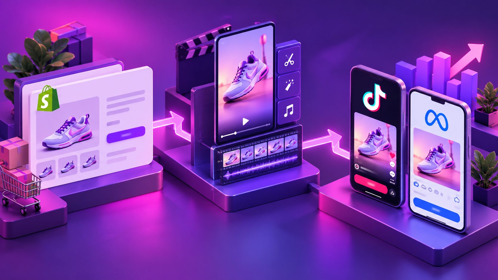
AdsTurbo supports product video generation, ad cloning, subtitles, video translation, character replacement, lip sync, motion control, and AI upscaling. Its Product Video workflow can use a JPG or PNG product image, while Video Subtitle supports synchronized captions and downloadable subtitle files. These capabilities can support a batch-testing workflow without requiring every variation to be filmed from scratch.
For the broader checkout journey, a three-step ecommerce checkout walkthrough video can also be used on product or cart pages before the exit trigger appears. That is a different job: the walkthrough reduces uncertainty earlier, while the exit popup handles last-moment hesitation.
Common questions
Does an exit intent popup work on mobile Shopify stores?
Mobile devices do not have the same cursor behavior as desktop browsers. Use mobile-specific triggers such as back-button intent, inactivity, scroll behavior, or cart-stage rules where supported by your popup system. Always test the experience on real phones.
Should the popup offer a discount?
Not automatically. Test product proof, free shipping, a bundle, a reminder, or a simple return-to-cart message before training shoppers to wait for discounts.
Should the video include sound?
Treat sound as optional. Muted autoplay with captions is safer for usability, while a clear audio control can support shoppers who want more detail.
Should the popup appear during checkout?
Prioritize the cart or product page unless your implementation is specifically compatible with the checkout environment. The popup must never interfere with payment fields, navigation, or required checkout actions.
What is the most important metric?
Start with incremental completed orders or revenue per eligible visitor. Click-through rate is useful for diagnosing the creative, but it does not prove that the popup improves business results.
A Shopify exit-intent video works best as a focused intervention, not a last-second interruption. Match the message to the visitor’s stage, show proof quickly, keep the CTA singular, and test the result against a no-popup control whenever possible.